This isn't venture-backed vaporware. It's one developer who gave a damn when it counted..
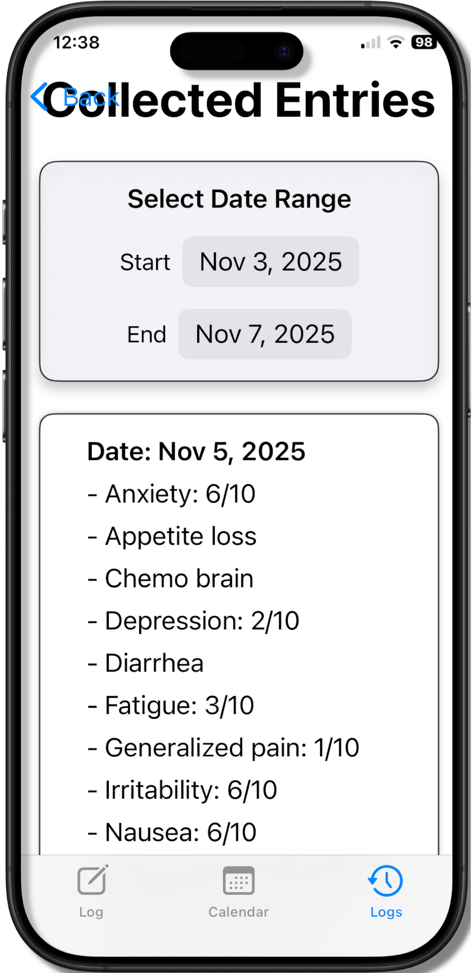
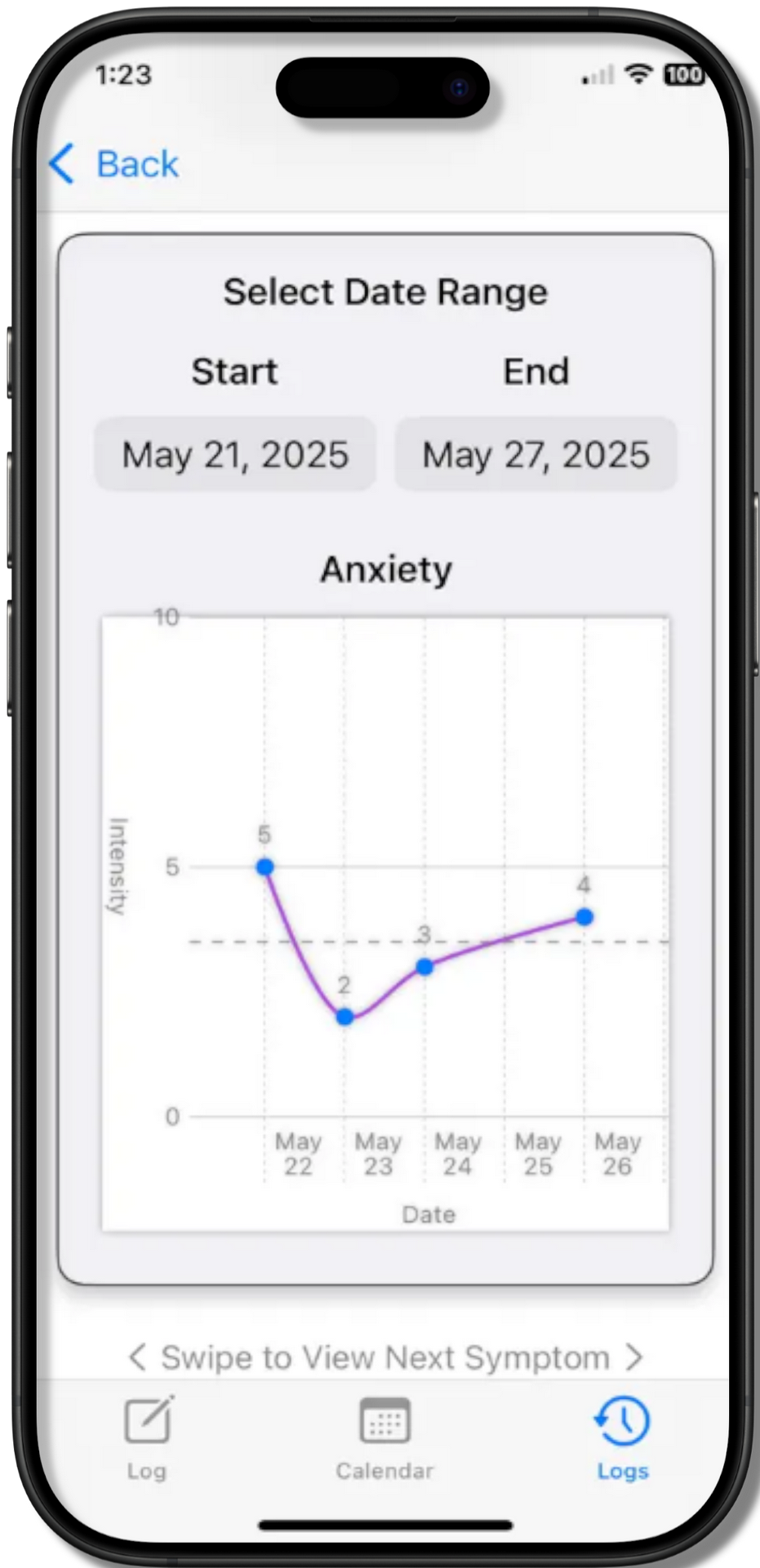
Select a date range to review the raw data. You can review each day in that range with your care provider.
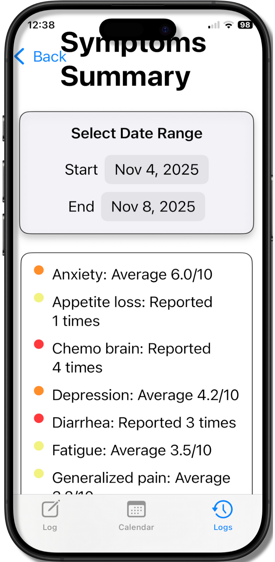
Quickly see how many times you reported nausea in a time period. We also classified the symptoms by severity. Each symptom category has a colored circle next to it. Yellow means that overall you rated the symptom as significant, but not disabling. Red means that you consistently rated the symptom as highly affecting.
Our Insights Graph makes it easy to see what symptoms were trending and when. This can make it easier to plan your life around your treatments, as you know exactly how many days after treatment you start to feel terrible.
Why is there a space here?? I don't know, really.
